When reading about App Store Optimization (ASO), the majority of content tends to center around picking the right keywords, optimizing your title, or writing a great description. One element that isn’t covered as much, which we feel has become even more important, is how to use your icon and screenshots to draw attention to your app and drive more downloads.
With the launch of iOS 8, Apple introduced a number of new elements to the app store experience. The most noticeable change was App Previews, which allows you to add video trailers to your app’s page. However, in addition to App Previews, Apple also switched to vertical scrolling for browsing apps, and added an additional screenshot to the app’s card.

These two changes, though small, provide both the need and the opportunity to draw attention to your app, attract more users to your page, and increase downloads.
Scrolling and Two Screenshots, So What?
You might be asking yourself, “OK, I scroll vertically now, and there’s another screenshot, what’s the big deal?” On the surface, not much seemed to have changed. However, there are some bigger underlying implications that accompany these additions.
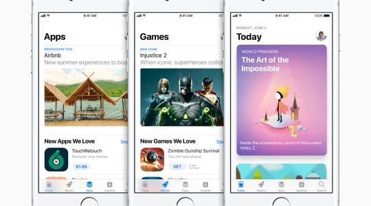
The first is the impact vertical scrolling has on user behavior in the app store. It is much easier now to search through a greater number of apps due to the continuous scrolling. With one swipe, I was able to go from the first to the tenth app. In the iOS 7 App Store, you were only able to scroll through one app at a time, no matter how hard you swiped. You might have also noticed in the screenshot above that there is a less clear distinction between where one app ends and another begins in the new app store layout.
What does this mean? This puts increased importance on standing out in order to draw the users attention. Previously, because the user was forced to swipe each time they wanted to see a new app, they were forced to linger on your card, even if only for an instant. This gave them time to be hooked by a catchy title or description intro. Now, it’s so easy to scroll quickly that users can spend little to no time looking at your app (and even less time reading a title). You have to do something to catch their eye and give them pause.
Enter: icon and screenshots. Users can view and evaluate an image much faster than text. This means, although your title is still extremely important for targeting search terms, you can’t rely on it as much to draw a user’s attention. Use your icon and screenshots as the initial hook – and then sell them with your video, title, and description.
The addition of another screenshot is also important. While the vertical scrolling resulted in an increased need to get users attention, the extra screenshot actually provides an opportunity to get creative and hook the user. We’ll touch on a few ways you can do this below.
What does this mean? This means you need to be working with your creative team to figure out a way to fully utilize all the real estate you have available. You have an opportunity to distinguish yourself from the competition, in a positive or negative way. Poor screenshots can make even a great app look bad. First impressions are a big deal, especially when dealing with something as fickle as the user’s attention in the app store.
Four Ways to Hook the User
We’ve identified a few interesting strategies used in icons and screenshots that can help you separate yourself from the competition and attract the user’s interest.
Here are four of our favorite strategies:
Holiday Themes
 It’s that time of year. Halloween just passed, Thanksgiving is a few days away, and Christmas is just around the corner. One thing we’ve noticed from some of the more successful apps is the creation of completely new screenshots or icons to match the holiday theme. This was especially popular during Halloween, and I’m sure you’ll see a number of apps utilizing this strategy in December. It’s not too late to throw together a new icon or screenshots for your app! All it takes is a little design work and an app update.
The ‘New’ Badge
 If you’ve made some major changes to your app, you want to do everything you can to draw attention to the fact that you’ve put time into improving your app and creating a better experience. You can do all the outside marketing you want, but one extremely simple and effective way to highlight the work you’ve done is to add a ‘New’ banner across your icons or your screenshots. We saw this with the ‘New Words With Friends.’ They even went so far as to change their app’s title. This is a simple, easy, and effective solution to show off your new app and draw the user’s attention when scrolling.
Two Screenshots, One Image
When initially browsing through the updated App Store in iOS 8, one of the first things that caught my eye was an app that created a single image out of the two screenshot spaces. Because the space was made to hold two images, there was a white space between the two, but they still made it look like one image.
It now appears that Apple gives you the option to actually add a single large image rather than two smaller ones. But to do this, all your screenshots must be in landscape mode when someone actually clicks into your app’s page. Although the single large image might be good for initially drawing the user’s attention, it’s slightly annoying to have to turn the phone to view what the other screenshots say. Consider if it’s worth it to have one image if it means all your other screenshots have to be in landscape mode as well.

The ‘Free’ Badge
Similar to the ‘New’ badge mentioned above, I’ve also noticed a number of apps including a ‘Free’ badge over their screenshots or icons. Again, this is a great way to draw attention to your app, especially if you offer a free and paid version of the same application. In a store where 90% of the apps are free, specifically stating that yours is as well might seem overkill. But remember, it’s not only about letting the user know your app is free – it’s about getting their attention.
Will It Really Help?
At this point, you might be asking yourself, ‘will this really help?’ Although there isn’t yet any quantitative proof or studies to support that it will, there are two specific examples I’d like to point out where a changed icon or screenshot is associated with a positive result.
The first, is when I saw that CSI: Hidden Crimes was featured in the App Store under the ‘Best New Updates.’ You’ll notice that the one distinct difference between their app and the others is that they had updated their icon to a Halloween theme. But were they featured just because they they made their app Halloween themed? Well, actually, I believe it played a big part. If you look at their release notes, you’ll see that the majority of the changes are related to something having to do with Halloween. We know Apple likes to feature apps showing off their new technology, so it’s not a stretch to say they might also like featuring apps that put effort into creating a great user experience. Will making aesthetic changes guarantee that your app will be featured? No. But it can’t hurt!


The second positive impact actually comes from a tweet from the MobileDevHQ GM, Ian, who tweeted out a picture noting that Splashy Fish released an update and changed their icon for Halloween. iPhones now automatically update apps when the phone is connected to WiFi and plugged into a power source, which often time means the user is not aware that the app was updated. However, after spending countless hours on their phone, people are keenly aware of what they should expect to see on their home screen. This tweet is evidence that if something changes, it gets noticed. Changing your icon can not only have an impact in the App Store, but it can also help with re-engagement and drawing the attention of a user who might not have used your app for a while.
The main point you should take away from this, is that you need to make your app STAND OUT. This doesn’t take hours of coding, or even the attention of a senior designer. All it requires is a little creativity and the willingness to try different things. Don’t conform to the styles of every other app, because you’ll get lost in the shuffle.
Author
Becky is the Senior Content Marketing Manager at TUNE. Before TUNE, she handled content strategy and marketing communications at several tech startups in the Bay Area. Becky received her bachelor's degree in English from Wake Forest University. After a decade in San Francisco and Seattle, she has returned home to Charleston, SC, where you can find her strolling through Hampton Park with her pup and enjoying the simple things in life.


Leave a Reply
You must be logged in to post a comment.