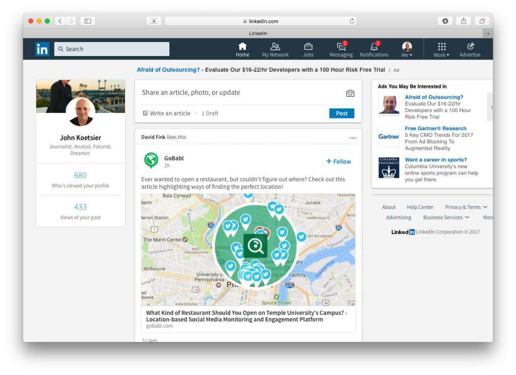
LinkedIn on the desktop
Is LinkedIn’s new user experience a perfect example of MobileBest?
MobileBest is meeting your customers where they are, whether that’s apps or web or other channels. LinkedIn’s new user interface attempts to unify the experience across desktop, mobile, and apps, and is perhaps the highest profile mobile first re-design to date.
I asked our director of user experience at TUNE, Eve Rallo, to evaluate it from a MobileBest perspective.
LinkedIn’s grand experiment
Some love it and some hate it. Wherever you land in that debate, LinkedIn’s “biggest-ever technical change” to its new user interface design is part of what TUNE calls MobileBest: an approach to customer engagement that is device and platform agnostic.
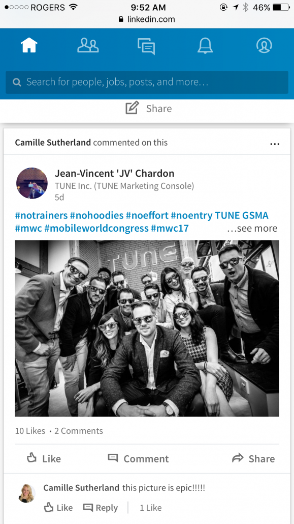
LinkedIn on the mobile web
First, however, few major changes happen without controversy:
- some think the new LinkedIn looks just like Facebook
- one person listed the “top 10 things I hate about the new LinkedIn”
- and some just want their old LinkedIn back again
But the design goal was simple: make LinkedIn more intuitive, faster, and easier to use. And to streamline usage and navigation across web, mobile web, and the LinkedIn app.
Did LinkedIn succeed?
On the native app, Rallo says LinkedIn is “generally pretty intuitive,” and easy to sign into, especially because the app can sense that you are logged in on a mobile web browser tab. The app uses real estate well — dropping the logo, for instance.
And navigation is thumb-friendly, thanks to its position on the bottom.
LinkedIn: the native iOS app
That’s different than the mobile web version, however, which positions main navigation on the top — just like the desktop website. It will be very interesting to see if over time LinkedIn moves mobile web navigation to the bottom, in sync with its mobile app, but out of sync with its desktop website.
“Bottom navigation feels more ergonomic since the hit area is closer to thumbs,” says Rallo.
The app has smooth screen transitions, she says, and a very simple layout which enables a distraction-free experience. The mobile web version is also fairly simple and leaves out the almost-ubiquitous “hamburger icon,” the three horizontal lines that have become synonymous in mobile apps with “more stuff here,” but can obscure functionality and confuse less savvy mobile users.
(Interestingly, one of the top results that Google surfaces for a query on “hamburger icon” is a question: what do three lines mean?)
Web versus mobile web versus app: changes
One challenge for the mobile web design version: unlike both the app and the desktop web version of LinkedIn, its navigation icons do not have text underneath them.
That means what is immediately obvious on the desktop web and in the app is not clear on the mobile web version, forcing users to “click around to figure out different sections,” Rallo says.
Not surprisingly, LinkedIn has also made some decisions about what matters most in terms of what it includes in that navigation.
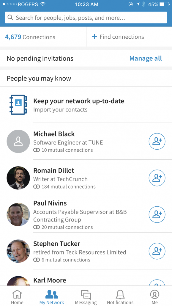
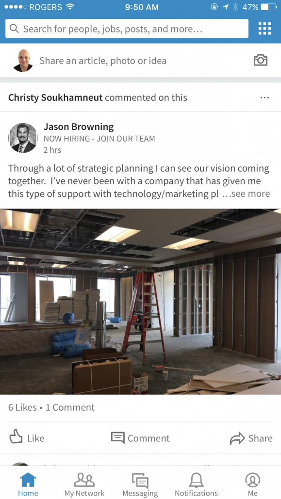
LinkedIn: mobile app, “My Network” section
On the desktop web design, LinkedIn first highlights nine major navigational sections across the top of each page, including its logo, from which you can always go “home.” (It’s eight if you don’t see the “Advertise” icon). The app and the mobile web version shrink that down to five key ones that focus on the social aspects of LinkedIn.
In addition, there are few or no advertisements in the mobile app and web versions, while there are multiple on the desktop web version. I wouldn’t expect that to last forever, although ads will almost certainly take different forms in the smaller mobile versions.
Summing it up: mobile-first design is MobileBest
LinkedIn knows that MobileBest does not mean a uniform experience across web, mobile web, and app. And you see the results in what the company has created: customized experiences for each.
That said, there’s likely room to improve in terms of both what LinkedIn presents and how it presents elements.
Ultimately, Rallo says she’d choose the app, with a few provisos:
“In general, I like the steps LinkedIn took to create a more customized experience, especially on the native app side. However, I would like to see more flexibility from the app to support my goals as my needs change throughout my career cycle. Finding connections, writing messages, and saving job listings were all pretty smooth experiences and I could see myself using the native app often for networking on the go.”
MobileBest is just that: giving users and customers the experience that works best for them. LinkedIn’s first re-design effort is a major move in this direction. More will be forthcoming.
Read more about MobileBest: what it means, what the experts say, and how Forrester thinks about it.
Author
Before acting as a mobile economist for TUNE, John built the VB Insight research team at VentureBeat and managed teams creating software for partners like Intel and Disney. In addition, he led technical teams, built social sites and mobile apps, and consulted on mobile, social, and IoT. In 2014, he was named to Folio's top 100 of the media industry's "most innovative entrepreneurs and market shaker-uppers." John lives in British Columbia, Canada with his family, where he coaches baseball and hockey, though not at the same time.